Case study · Fintech / BFSI
Finjoy lets financial advisors refer banking and insurance products to their clients. The product worked — but new advisors rarely made it through sign- up. I rebuilt the journey around progressive disclosure and clearer KYC, lifting onboarding conversion by 23%.
Client
Finjoy Technologies
Role
Product / UX Designer
Year
2024
Platform
iOS · Android
Timeline
4 weeks
Team
Domain
Fintech / BFSI
Tools
Figma · Maze · Mixpanel

Context
My role
The problem
Advisors faced a single, unbroken form that demanded
PAN, bank details and document uploads before showing
any value. Verification states were invisible, errors were
generic, and payout terms only appeared at the very end
— so most people abandoned midway and never returned.
The approach
Sequence the journey by commitment: let advisors explore
products and see earning potential first, then collect
identity in short, explained stages with live status. Every
screen answers "why is this needed and what happens
next?".

Process
01
Discovery & research
Interviewed 12 referral agents and reviewed funnel analytics to locate the exact steps where sign-ups
collapsed — document upload, bank verification and unclear payout expectations.
02
Reframing the flow
Split a single long form into progressive stages, deferring heavy KYC until intent was established, and
made every step state its purpose and time cost up front.
03
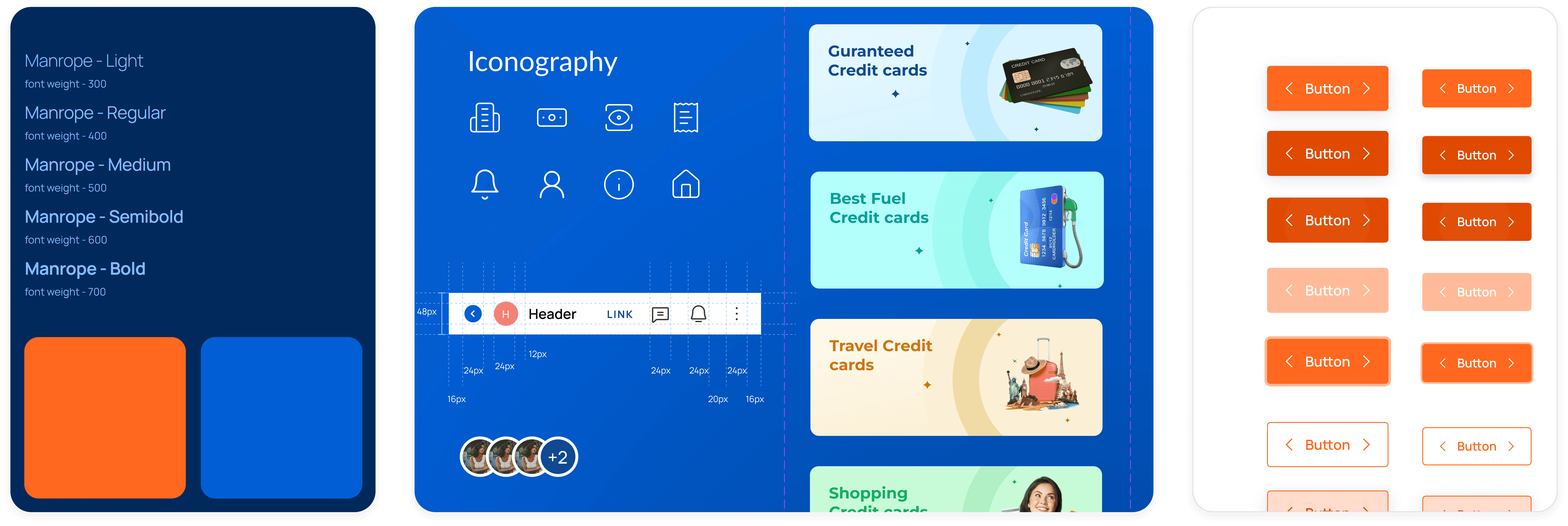
Interface & system
Built a compact component library — inputs, status chips, document cards, empty and error states —
so BFSI edge cases had a defined visual language instead of ad-hoc screens.
04
Validation
Ran usability sessions on the prototype, then instrumented the live funnel to compare stage-by-stage
completion against the previous release.
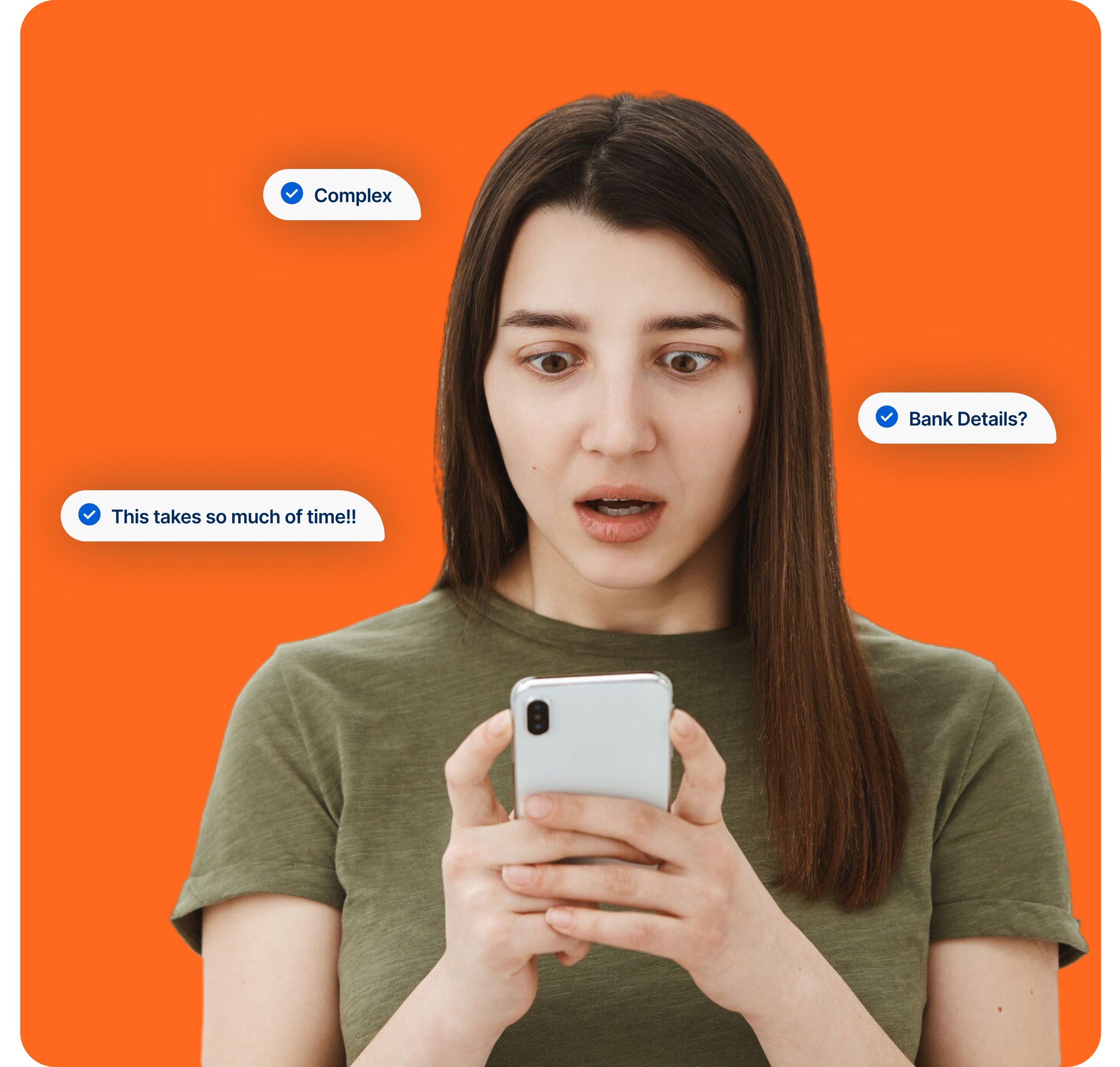
Onboarding Friction Points
The existing Finjoy onboarding journey contained multiple friction points that negatively impacted user trust, onboarding completion, and
activation rates.

What research showed
KYC arrived too early
Verification felt like a dead end
Errors said nothing useful
Earnings were unexplained

Competitor Analysis
To better understand onboarding patterns and user expectations in the fintech referral ecosystem, I analyzed leading BFSI referral and earning platforms in India.

New Onboarding Flow
To improve onboarding completion and reduce user drop-offs, the onboarding information architecture was completely restructured.

Low-fedelity Wireframes
Before moving into high-fidelity UI design, I explored multiple low-fidelity wireframe concepts to simplify the onboarding experience and
reduce user friction.



Design system
Designs
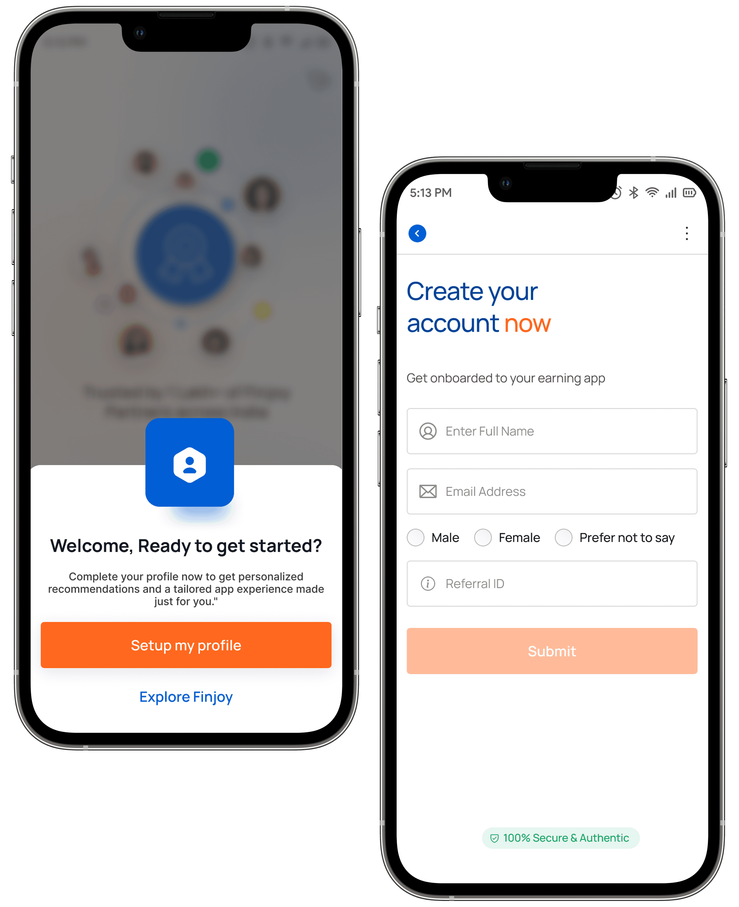
After validating the onboarding structure through wireframes, the next phase focused on creating a polished, modern, and trust-driven high-fidelity experience for the Finjoy
mobile app.


Outcome
+23%
Onboarding conversion
-38%
KYC drop-off
2.4x
Referrals per agent
-55%
Design inconsistencies
What I’d do differently
Takeaway

Dive into the next project

03 · 2023
Disney+ Hotstar
Product Design
Retention
Research
04 · 2023
Logistics
Workflow simplified end-to-end
Product Design
Systems
Research
Next Case Study
View All